Language Confusion
Exploration, Integration and Displacement of Language Boundaries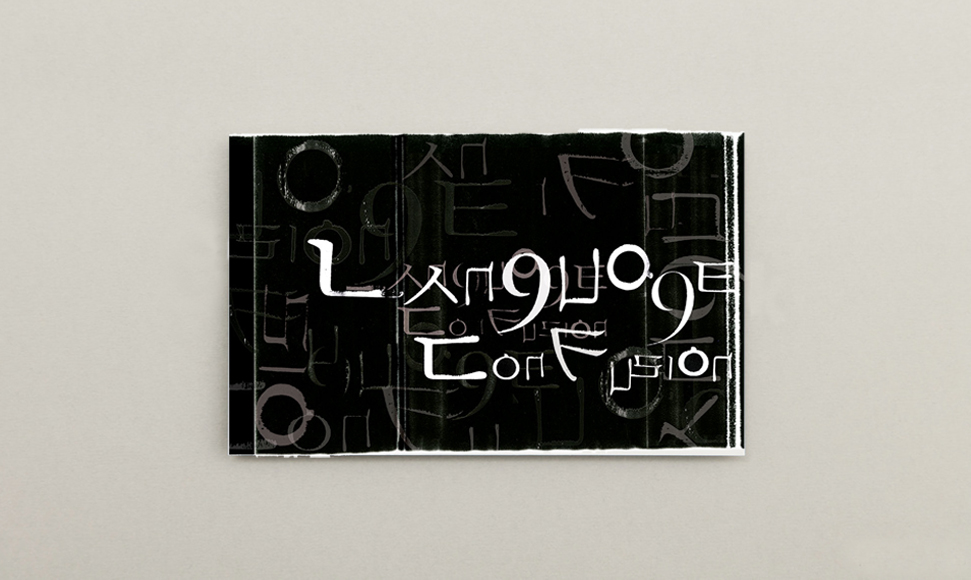

This experimental typography project creatively repurposes Korean characters, Hangul, making them intelligible as English words. It resonates with my multifaceted experience as an artist, designer, and educator, navigating the intersection of diverse domains.
Having lived in both Korea and America, I’ve gained profound insights into the nuanced dynamics between art and design, visual and emotional culture. I’ve come to understand that I inherently inhabit the realms of both insider and outsider, straddling two distinct cultures and occasionally finding myself in the space between. I acknowledge that the work may appear visually awkward, yet at the same time, that is where I see the beauty of embracing a plural and multifaceted identity.
Filed under Typography, Prints